Table of Contents
Apple App Store has more than 2.22 million iOS applications. You can’t afford a poor iOS app design with so much competition in the market.
As per the top iOS app development companies, it can be difficult to find design inspiration, particularly when trying to create designs that are unique.
You’ve found the right place. This comprehensive guide will teach you everything you need to learn about designing an iOS app, including tips and best practices. We’ll show you some designs that you can copy.
What is User Interface (UI)?
If you are thinking about how to design iOS app to look good, then we are here to help. The user interface is a part of that. This is how a mobile app looks and feels to users when they interact with it.
The UI designer must consider the user interface when designing an application. User interface is what determines how appealing your application looks. UI designers cannot ignore the importance of creating an attractive user interface.
UI is a collection of icons, buttons, fonts, colors, animation and other images. Simply put,
UI = Interface between the user and the digital product
What Is User Experience (UX)?
Steve Jobs (Founder of Apple), once said: You must adopt a client-centric approach. Start with the customer’s experience and technology will follow. The user will be the one who breathes the products if they are at the center.
As per the top iOS app development agency, UX is the experience that users get when they use an app. The user experience of an app can leave a lasting impression on users. UX designers strive to create an app interface that is simple and interactive, but can satisfy users.
It sounds confusing.
Use an example to help you understand UI and UX- UI relates the shape, color, and design of the car. The UX is the feeling that a person has after driving a car.
The Importance of UI/UX in iOS App Development
As per the top ios app design agency, following are the reasons why UI/UX is important for iOS app design.

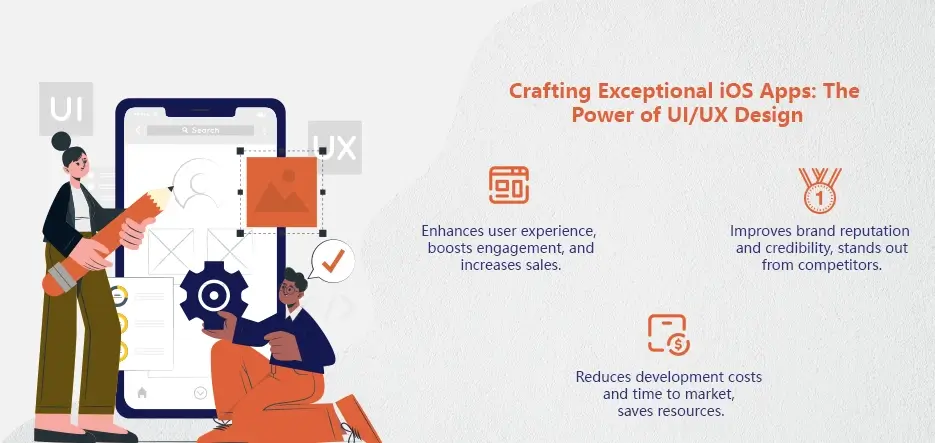
Enhances User Experience
The UI/UX Design of the iOS application can attract visitors and encourage them to spend more time in the app. This will increase the time spent using the application. Apps that are poorly designed and look unprofessional will not be used by users.
Customers are often delighted when an app offers a great user experience. This leads to high conversions and increased sales for businesses.
Remember! Remember!
Here’s a list of ways that designers can improve the user experience for an IOS application –
- First, conduct research on your target audience to better understand their needs and preferences.
- Simple navigation in your app
- Apps should have consistent design elements
Hopefully the above pointers will put the debate of iOS 17 vs. Android 13 into rest.
User Engagement and Retention Increased
According to research of the iOS app development company, every dollar spent on UX Design leads to a ROI worth 100 dollars.
How well your app’s UX/UI design is executed will determine the percentage of users who return to it. A smooth navigation interface allows customers to spend more time on the app, and makes them make more purchases in-app. Poor user experience can lead to higher churn.
A good UI/UX of an IOS application will most likely influence the growth of mobile applications. A well-designed application will also provide a better user experience and keep your users for longer. This increases your retention rate.
As per the top custom app development agency, an app with a good user experience will encourage more users to download it, resulting in a higher level of engagement. A higher level of engagement increases the chances that the business will earn more.
Improves Brand Reputation and Credibility
An app with a creative and seamless UI/UX delivers a great customer experience. Moreover, the success of a company depends on its user interface design. A good UI/UX will always make your customers love your product.
Investing in the UI/UX for an IOS App will increase your brand’s visibility and help you stand out amongst competitors.
Reduces iOS App Development Cost and Time to Market
As per the top mobile app development companies in USA, if the UI/UX of an IOS application is well designed, there’s less chance that users will encounter obstacles. You won’t need to spend millions updating your app if it has a good UI/UX.
You can therefore reduce the time and iOS app development cost significantly.
Revolutionize Your iOS App Design Experience!
iOS App Design Guidelines
These iOS App Design Guidelines by the top custom mobile app development company are essential when it comes to designing iOS applications.
Apple has taken the initiative to create iOS App Design Guidelines. This is something every designer should do at least once.
We will discuss the same guidelines in brief here. Let’s start with the basics.
Embrace Simplicity
Simplicity is something that can be seen in all versions of iOS, and its apps.
It is therefore safe to say that simplicity is at the core of iOS app development. Focusing on simplicity and clarity, you can design intuitive interfaces users will love.
Streamlined Layout
It is important to keep the layout of your iOS app clean and uncluttered. There should be plenty of white space to let content breathe.
Avoid overloading users by displaying too many elements at once.
Intuitive Navigation
It is highly recommended to design intuitive and clear navigation paths using familiar iOS navigation patterns, such as tab bars and navigation bars.
Then, make it easy for users to navigate your app.
Familiarity and Consistency
You can tell that even if you jump straight from iOS 10 to iOS 16 you are still using the same platform. Apple’s consistency is evident in this.
Apple’s guidelines on iOS build time optimization and designing promote consistency and familiarity. This ensures a consistent and seamless experience for iOS users across all devices.
Even if it is their first time using your app, users should be familiar with its interface.
How can you achieve this? Well, here’s how:
iOS Human Interface Guidelines
Apple has updated its iOS Human Interface Guidelines.
These guidelines include everything from button designs to icon designs and provide a uniform look and feel for the entire platform.
Leverage System UI Elements
To maintain consistency, designers should use native iOS controls and UI components. This includes buttons and sliders.
You can tap into the users’ familiarity with iOS by utilizing these elements.
Typography
Did you know typography is a trend in UI/UX Designing today?
Typography is a key element in your overall app design.
It is important to always consider legibility when choosing fonts and that they enhance the user’s experience.
Text that is Easy to Read
Choose fonts that are easy to read and legible for iOS app designs.
Avoid decorative fonts, which can make it difficult to read, particularly for long blocks of text. For optimal results, stick to the system fonts.
Font Sizes Hierarchy
The designer should create a hierarchy of font size to direct the user’s attention. Use larger fonts for important information and headings, while reducing the size of secondary content. Keep font sizes consistent across all apps.
Colors and Visuals
The color choices and visuals you choose will contribute to your app’s overall aesthetic appeal. Colors can be used to evoke emotions, reinforce your brand identity and help with navigation.
Consistent Color Palette
Select a color scheme that is consistent with the branding and purpose of your app. Use Apple’s color guidelines for a harmonious look that matches the iOS ecosystem.
Enhance Functionality with Color
Use color to guide and inform users in ios app design services. The color can provide visual feedback for user actions, such as indicating the different states of buttons.
Accessibility Issues
By designing with accessibility in the forefront, you can ensure that your app is accessible to a broad range of users including those with hearing or visual impairments.
Dynamic Type
Support Dynamic Typing to allow users the ability to change font sizes according to their preferences. This will ensure that the text is legible for all users.
Understanding iOS App Design Principles
Understanding UI/UX is very important for UI/UX designers
User Centered Design Approach
In custom mobile app development services, iOS app design puts the user’s needs and preferences first. Designers can create engaging and intuitive experiences by understanding the goals, expectations, and behaviors of users. This involves user research, feedback gathering, and iterative design to ensure that the app meets users’ requirements.
Simplicity and Minimalism
iOS app design is all about simplicity. Clean and uncluttered interfaces are emphasized to allow users to concentrate on the core functionality. Designers create intuitive and visually appealing interfaces by removing unnecessary elements.
Familiarity and Consistency
In iOS app design, consistency is key to providing a consistent experience across screens and interactions. Apple’s Human Interface Guidelines are followed by designers to establish design patterns, typography and navigation elements. Consistency is key to ensuring that all users, no matter their experience with iOS, can navigate and understand the app.
Hierarchical Organization of Information
iOS app design uses a hierarchy to help users quickly and easily find information. Designers can create logical navigation paths by arranging content logically and in a structured way. This will also make important information easily accessible. This method involves the use of menus, tabs and categorized content in order to guide users through an app’s functionality and features.
Tips for Designing iOS Apps
Simple steps to design better apps are provided in the following sections. This will not only impress your users but will also help to distinguish you from other iPhone or iPad apps in the app store.
You should also be aware that the mobile UI for iOS apps is different from Android apps. It’s possible that your design concept for one platform will not translate into the UI elements on the other.
Choose the Right Color Palette
Colors should be chosen to match your brand, as this will influence user behavior through familiarity. Colors help users instantly associate your brand with what you offer.
Color palettes that are predefined make it easier to see important features of an app. Contrasting colors, for example, can affect how CTAs or other UI elements appear on each screen. Color palettes must be consistent throughout the design of your app.
Use Finger-Sized Tap Targets
In custom iOS app development services, another design concept directly related to user experience. Your app must allow users to click, scroll and navigate seamlessly. If the tap elements in your app are too small, or too distracting, they will reduce the usability of the app.
Apple recommends that any element of user interaction be a 44x44px tappable target. This will ensure that your users won’t miss any buttons or become frustrated while trying to click through the app.
Consider this tip when designing your tap targets. You can extend the area that is tappable of a CTA past the size of the button. If someone clicks outside the button, but in a place that is clearly meant for action, then the click will be recognized.
Create A Wireframe For App

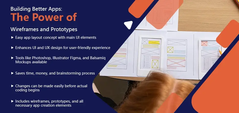
Wireframes are a simple app layout that shows the main UI elements on key screens. This is the first design concept you will create before any actual work begins.
Wireframes are often created as simple sketches on paper or napkins. Here, you should think about user interface (UI), and the design of user experience (UX).
Wireframes can be created using a variety of tools. If you want to explore your options, try Photoshop, Illustrator Figma and Balsamiq Mockups.
Did you know BuildFire plus can handle all your app development and design for you? It includes wireframes and prototypes as well as everything else needed to create an app.
Add Extra Views
Clutter is the most common design mistake. It can be detrimental to the user’s experience. You can add extra views to make it easier to manage information rather than cramming everything into one view or screen.
Scrolling or buttons can be used to bring the user to another screen. This not only removes clutter from your screen, but also helps to avoid confusion for users when navigating the app. You should consider this when creating a wireframe.
If you’re unsure, it is always best to leave blank space or negative space on a screen instead of adding more text, images, or buttons.
Consider iOS Gesture Norms
Apple’s gestures are unique in comparison to other platforms. You should become familiar with the standard iOS actions, since users expect specific results from certain actions.
When a user presses a button, they expect to see something happen. Don’t make all your CTAs require a double tap. Users expect a second action when they tap the table–this is an iPhone standard gesture for zoom.
You should also make sure your app gestures do not interfere with the system-wide iOS setting. Certain gestures, for example, will automatically take the user back to their home screen. The control center is revealed by swiping downwards from the top.
Your users will be confused and frustrated if your app performs something else.
Don’t Design Your Light and Dark Appearance Setting
Don’t create separate designs to reflect light and dark. Dark themes are becoming more popular in web design. However, you should not apply this trend to iOS app designs.
Apple’s system settings already allow users to customize the look of their device. Your dark and light designs may clash with existing theme settings for a phone or tablet. This could hinder the user’s experience.
It is also important to note that this can be a problem for those who use certain settings for accessibility. It’s better to avoid dark and light settings. Don’t worry if users choose to apply these themes on their devices.
Do: Create an adaptable user interface
Adaptability is a major focus for interface design. The UI elements can’t be designed with a single device in mind. The interface must be compatible with all iOS devices.
All iPhone and iPad models running different iOS versions are included.
When the app is run on another device, the user interface should automatically change. Split views on an iPad, for example, should be considered. What will happen to the typography and UI kit when the iPhone screen is rotated?
App design and usability will be affected if you don’t consider adaptability.
Inspiration for iOS App Design
When you hire iOS app designer, the examples below can help you come up with design concepts. Find iOS design inspiration across a variety of categories, while keeping up with the latest UI/UX trends.
When designing a mobile app, templates and existing apps can be a great source of inspiration.
Banking Application
Here’s a design for a banking application from Ishtiaq K. Parag on Dribbble.
You can see that it is a little different from traditional financial apps. Users really like the soft, friendly color palette of this iOS app.
You can tell that the design was also created for functionality if you pay attention. If a user is trying to access or click on a credit card, the differences in color, size, and space make it easy to differentiate one card from another.
Social Media Application
The iPhone X Social app by Shakuro is a modern iOS application concept for social media.
Design prioritizes smooth navigation through profiles. The layout is simple and easy to understand. There is a clear hierarchy of images.
It is easy to see how to quickly search for or navigate to specific parts of the application. It’s very clean and it works well on iPhones. The style of the imagery is also appealing. The design is not only visually appealing, but it also works well.
Ecommerce App
BuildFire has created an app for e-commerce.
The white space in the design allows you to focus on the most important part of this app: its products. The products are clearly visible in each screenshot.
Users can easily browse products and add them to their carts because there is no clutter on the page. The screens don’t have a lot of extra information so CTAs such as “add to basket” stand out.
A menu at the bottom makes it easier for users to access the most important pages of the app.
Smart Home iOS App
The Smart Home Control App Concept designed by Kristina Malia for Steelkiwi Inc. and published on Dribbble, is an excellent example of a design that does not sacrifice functionality.
This concept of a smart home app has a minimalistic aesthetic, but still has an extremely functional dashboard.
The user can easily navigate between screens and get tons of information in a single glance. The color palette matches the brand and is on-brand for this concept.
This all translates into a positive experience for the user, as they are trying to control multiple aspects of smart home technology.
Music Application
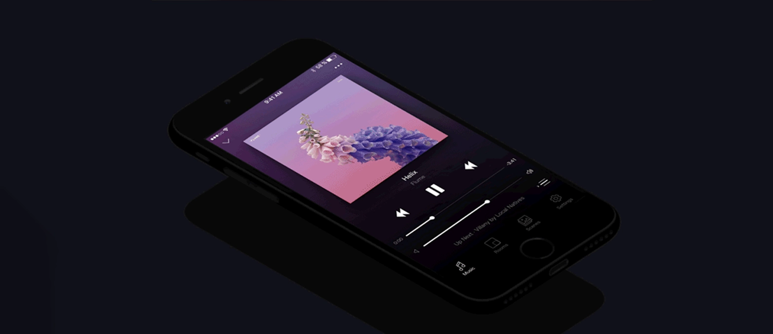
When searching for inspiration in music apps, you can’t go past the industry leader Spotify.
Spotify is a fantastic app, and not just because of its brand recognition. The primary purpose of Spotify is to be a music player. Spotify makes it simple for users to customize their listening preferences and find podcasts.
The app’s interface is easy to use, and the user can choose different features and benefits depending on their subscription price.
It’s always a great idea to follow the example of Apple Music or Spotify when you want to create an audio podcast.
Event Planning App
BuildFire has created another app for events.
The design options for mobile apps are very flexible. The type of event that you plan will determine the design.
A concert app, for example (such as the design shown above), would be quite different from an app to plan a wedding or one that facilitates networking at business conferences. The color scheme must be in line with the theme of the event.
The design of iOS apps should always prioritize functionality. Users should easily be able to find out about the event, register, communicate with other attendees and do other important tasks. It is also important to have a section in the app that is dedicated to sponsors and exhibitors.
When you are creating the wireframes for your event app, you should consider the CTA’s placement and color.
Meditation App
Headspace has become one of the most widely used apps for meditation and sleeping.
If you want to design an app with similar functionality, this is a great concept. The color palette helps to put the user in a meditative mood.
The screens are easy to navigate, allowing people to select the best type of meditation to suit their unique situation. Choose from anxiety-reduction tips or stress meditations. The app’s design makes it easy to access all the options.
Book 30 Minutes Free Consultations with A3Logics Experts to Start Your App Journey Today!
Conclusion
When you create an iOS app, UI/UX is crucial. Start with the correct color palette. Use finger-sized gestures. Create a wireframe. Add extra views. Consider iOS gesture norms when designing your app.
You can keep your app’s user experience high by following the latest design trends. Platforms like Dribbble Behance and Pinterest can provide you with iOS app design ideas. A template can be a great place to start when looking for ideas.
A3Logics offers a free best iOS app design consultation to those who need help with their iOS app design. A3Logics will handle the entire app design process for you. They also have the expertise to help you with iPhone emulators for PC We’ll then take this design and turn it into a stunning application. Visit our app showcase and customer stories to get more inspiration for app design.
FAQs
What are the latest trends for iOS app design?
The latest trends in iOS application design include minimal interfaces, vibrant and bold colors, custom illustrations and animations, support for dark mode, and the iOS design system called “Human Interface Guidelines.”
How do I create a successful iOS application?
In order to design a successful iOS application, it’s important to focus on the user experience. This includes following iOS design guidelines, creating a visually appealing, intuitive interface, optimizing for different screen sizes and conducting usability tests. With experts, you have nothing to worry about, even Swift vs. Flutter. So, hire experts at A3Logics to get all issues resolved.
Why should I hire an iOS app design agency to create my app?
Hiring an iOS app design agency will ensure that you follow best practices, integrate the latest trends and provide a seamless experience for your users. A design agency can offer expertise on designing for Apple devices and optimizing performance. They can also provide updates and support.
What tips can you give me for creating iOS apps?
Key tips for designing iOS applications include knowing your target audience, researching competitors, creating a consistent visual hierarchy, utilizing native iOS interface elements and optimizing performance and loading time, as well as continuously iterating the design of the app based on feedback from users.
What should I look out for when hiring an iOS App Designer?
When looking for an iOS app designer to hire, you should look for someone who has a portfolio of their previous iOS apps, a solid understanding of iOS guidelines and guidelines on human interface, proficiency with design tools such as Adobe XD or Sketch, the ability to collaborate, and excellent communication skills.


